Our client, Link2feed, offers case management software to a wide range of nonprofits, from large national organizations and state governments to local church groups run by volunteers. Link2Feed approached us with a desire to improve their current client intake workflow to speed up the process and enhance the interface design.

Our final solution involves redesigning more intuitive and customizable website interfaces that align with WCAG 2.0 level AA standards. You can check out the prototype here:

Figma

Figjam

January 2024 - April 2024

4 months

Yisu Hu, Kailai Yang, Jian Zhang, Yiran Zheng

Design Lead

Project Manager

Primary Client Contact

"We're receiving customer complaints, and we're aware of the issue, but we simply lack the necessary know-how."

After evaluation, my team and I discovered that they also face potential visual accessibility challenges, especially considering their users are primarily older adults. Non-optimized text sizes, low color contrast, and a cluttered layout became barriers. Additionally, the reduced efficiency was due to unclear information architecture and inflexible data entry. Users spend much longer than expected time to add a new client, demonstrate a low utilization rate of the training feature, and often feel overwhelmed by the amount of information being displayed all at once.

Project Summary

Timeline

Co-workers

Role

Tools

The Problem

The Solution

Primary Research.

Understand Direct Users

The primary users of their product include food bank executive directors, managers, coordinators, training specialists, and volunteers. Before embarking on the redesign, our aim was to first comprehend their pain points and needs, and to determine if there were additional business opportunities for our clients that could be uncovered while overcoming the obstacles in current design.

We did this by interviewing with direct users from each user group and met with stakeholders such as the customer success team and development team to gather insights on the challenges from front workers' perspectives and their thoughts on potential solutions. Plus, we sent out online questionnaires to collect both numerical and qualitative feedback from a larger sample size.

We ended up receiving 655 survey responses, and I conducted interviews with 4 user focus groups, 2 stakeholder focus groups, and 7 semi-structured user interviews.

49%

of surveyed users are older adults aged 65 years old or older.

37%

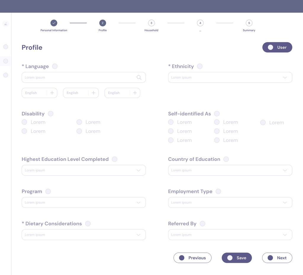
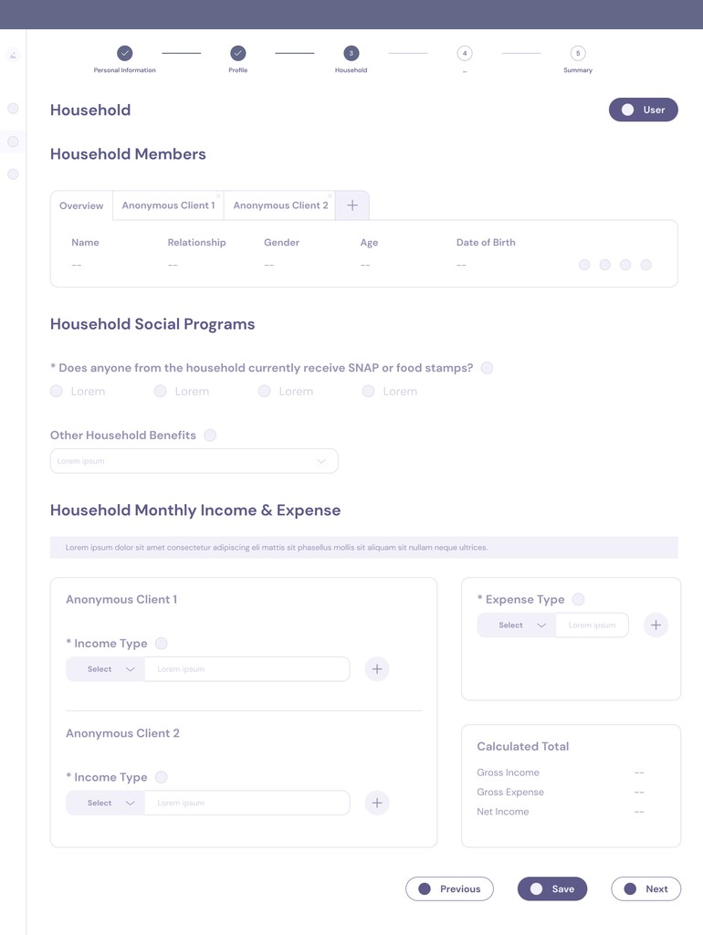
of surveyed users considered 'Household Members' as the most challenging step.

3 in 10

of surveyed users struggled with visual accessibility challenges during the process.

“The volunteers complained that the current onboarding process takes too long and seems disjoint...when it's on the food distribution, there'll be one more client to be out of hereas fast as they can. We don't want them to wait. ” - Coordinator 2

“When we were creating our client information, we did need to know more about students, like undergrad or grad. We want to delete some other questions and add more related, but we couldn't do so.” - Focus Group 3

In the interview, we asked them if there was one major difficulty to name that continued to affect their experience and had a significant impact. They pointed out...

#2 Lack of Autonomy

#1 Inefficient & Disjoint

How Might We redesign the process to be more effective, customizable and accessible for users with varying digital literacy, considering their visual, cognitive, and technological needs?

Personas.

Meet Grace the Supportive Volunteer

Grace is one of the primary users in our study, representing volunteers. She helps to train other volunteers and wishes for them to learn quickly. She highly values the efficient use of the system because of her busy schedule.

Meet Bella the Busy Manager

On the other hand, Bella is one of the secondary users in our study, representing those in managerial roles. She does not come from a technical background and has to onboard hundreds of people in need everyday.

Ideation.

Best Design Solutions on Board

I suggested prioritizing research insights and conducting a thematic analysis, which significantly saved effort by allowing us to pivot impactful and feasible solutions before depicting an ideal journey. We also discussed our findings and ideas with the product manager, who loved some of the fresh concepts. These ideas later found a new business opportunity that helps to distinguish them in the crowded market and improved usability for their users. Following that, I created a prioritization grid to choose ideas that would best benefit the product.

Re-organized Content

Merge and group similar categories or information according to users' behaviour.

Customizable Feature

Individuals in managerial roles have access to freely adjust input fields based on feedback.

Visual Accessibility

The use of adjustable text sizing, visual cues and optimized color contrast fosters visual inclusivity.

The three major design changes are as follows, selected for their high feasibility, high impact, or both. Most importantly, these changes address the challenges identified in user research, such as duplicate entries, disjointed questions, and a lack of autonomy and visibility.

Journey Map.

Imagine Bella is Updated with the Redesign…

Before redesign: Bella was once receiving complaints from volunteers that some mandatory fields were considered 'unnecessary' to fill in for their organization, whereas certain information was missing. One client had six household members, and each entry required too many pop-up windows that slows down the progress. By the time they completed the intake, the line outside had already become chaotic.

After redesign: Bella now knows which tools are available to her, resizes the text at any time, customize templates for her organization, and experience a significantly faster intake process.

Wireframes.

Introduce Critical Changes but NOT Overwhelm Users

I was responsible for crafting the wireframes while also considering the user flows that invisibly guide users through many design changes without requiring a steep learning curve from them. These wireframes will also contribute to our first round of usability testing and serve as the foundation for the high-fidelity prototype.

Flow 1: Adjust the Text Size

Flow 2: Customize a New Template

Flow 3: Fill in Personal Information and Profile

Flow 4: Add a New Household Member

Usability Test Findings & Iterations.

Reconnect Interviewees for Feedback

Luckily, we were able to reconnect with the interviewees from our primary research to try out the redesigned process. Each user base—volunteer and managerial—has 5 participants to maximize the diversity of insights derived from testing. First, a 5-second test was designed to see if participants could recall the major functions of the redesigned interfaces. Then, participants were asked to verbalize their thoughts while navigating the interfaces in given scenarios. Lastly, we ended with a few follow-up questions about their overall experience. We mainly wanted to study if these design decisions made sense to users:

  1. Was there anything that added potential friction to the process of filling in personal information?

  2. Were participants in managerial roles able to catch the essence of customization?

  3. Were the re-organized categories made easier or more efficient for them to intake information?

  4. What features did they expect to see but are currently missing in the whole process?

Positive Feedback

Simplicity

All participants mentioned that the process was streamlined and adding household members was simple and efficient.

Cleaner Layout

A few participants expressed appreciation for the cleaner layout and visual cues, noting that the content is no longer overly crowded and clear.

Thumbs up for Toolkit Bar

All participants noticed that the toolkit bar can be expanded and now includes a new text resize feature that increases readability. They also realized, for the first time, that supporting documents and tutorials are available there.

Negative Feedback

Differentiation

Some participants would like allergies and dietary preferences to be distinguished.

Avoid The Use of Red

One participant specifically mentioned that she has some concerns around the use of red, and it could create a sense of anxiety.

Low Familiarity

Some participants worried that they might need time to adapt to the new layout.

Final Design.

Incorporate Insights and Created High-fidelity Prototype

We kept the elements that worked, found solutions for the negative feedback, and created a high-fidelity prototype. A style tile was created to explain branding and color choices. Also, I ensured that the design system was built in Figma before handing it off to the dev team.

001 RESIZE TEXT

We brought an expanded toolkit bar to the dashboard, transforming the original link2feed logo in the lower right corner to enhance the visibility of existing features. This update also includes a text resizing feature.

002 CUSTOMIZE INTAKE

We introduced a new customization feature to differentiate Link2Feed’s product in a crowded market. This feature allows different organizations to edit their intake process, including input fields and orders, according to their specific needs.

003 PROVIDE VISUAL CUES

As users begin to fill in personal information, they will notice a glowing effect around each input field, which provides visual cues about their current selection. Input fields with more than ten options are presented in a dropdown menu with a search function.

004 MERGE & ERROR FEEDBACK

In terms of the previous content being uneven between each step, we wanted to achieve the goal of minimizing the number of tabs and excessive clicks for users. Thus, we grouped relevant sections for clearer navigation. To help users recognize the error, we added a timely error message with visual cues.

005 COMBINE SECTIONS

The "Household Member" is explicitly combined with "Monthly Income and Expense" because they are closely related. This integration also simplifies the interface by eliminating disruptive pop-up windows for households. Currently, users navigate between the tabs vertically and can add as many household members as they wish.

Reflection.

What I Learned & Next Steps

01.

Accessible for All

Keep in mind that people may experience various conditions and accessibility issues. Overlooking accessibility guidelines could potentially exclude a significant number of users. Accessibility considerations can also be counter-intuitive. Given more time and resources, I may consider A/B testing in these cases, allowing users to try out and select from several different options or modes.

02.

Keep Everyone in the Loop

It is crucial to keep not only the design team but also other teams updated. The project went smoothly because I constantly involved the product manager in our ideation sprints and presented our deliverables to the senior leadership team. I realized that when other teams are busy with their schedules, I should reserve enough time to provide them with the right context and listen to their thoughts.